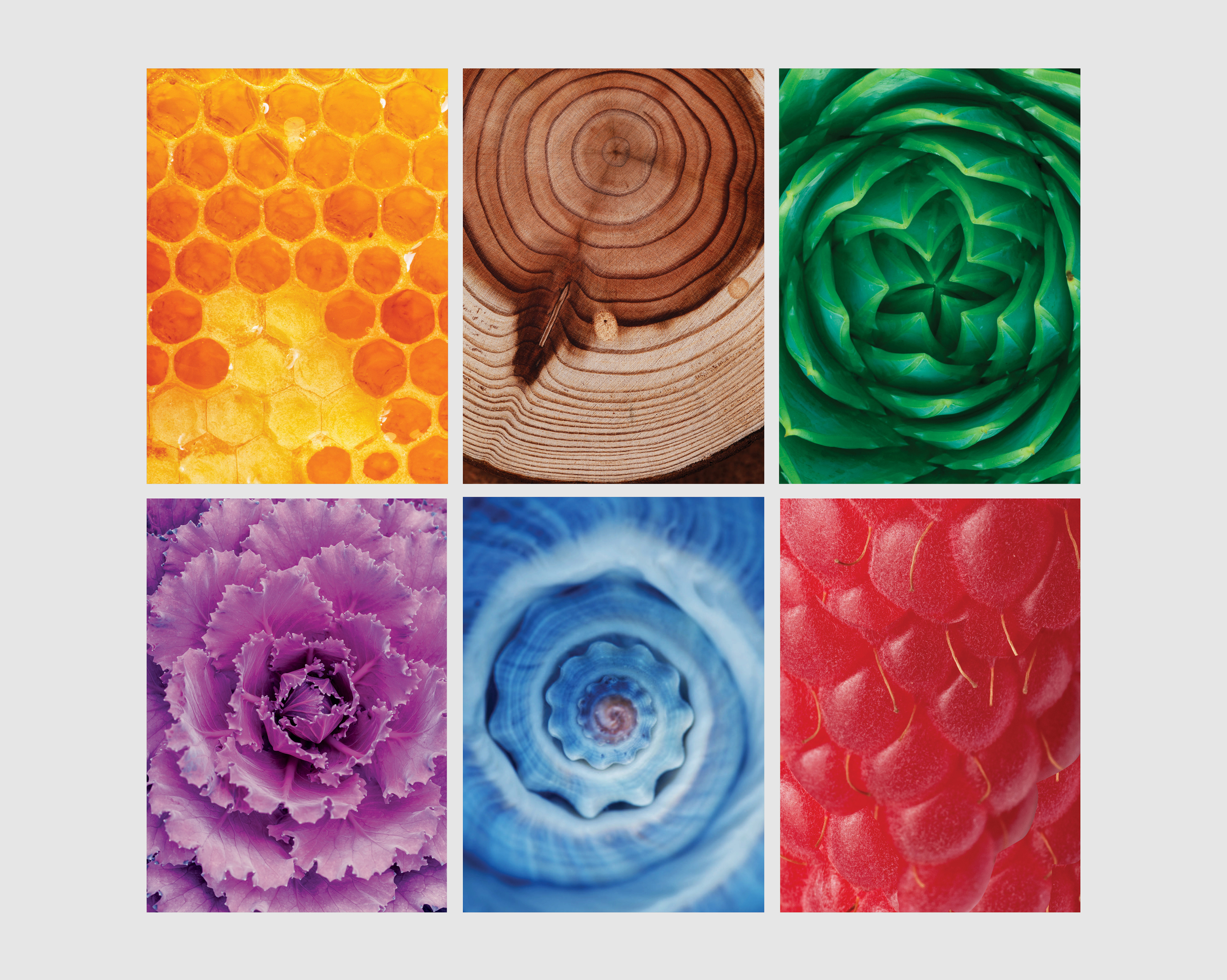
It was important that Acumen & Trust Imagery stood out against their competitors. After a lot of research, the idea of fractals was employed as the foundation for all images.
A fractal is made up of many simple structures that are all the same but build on each other to create a larger structure. This lent itself perfectly to the idea of saving – putting the same amount of money away regularly builds to form a strong foundation for your retirement. Below are the key images that are being used by Acumen & Trust.
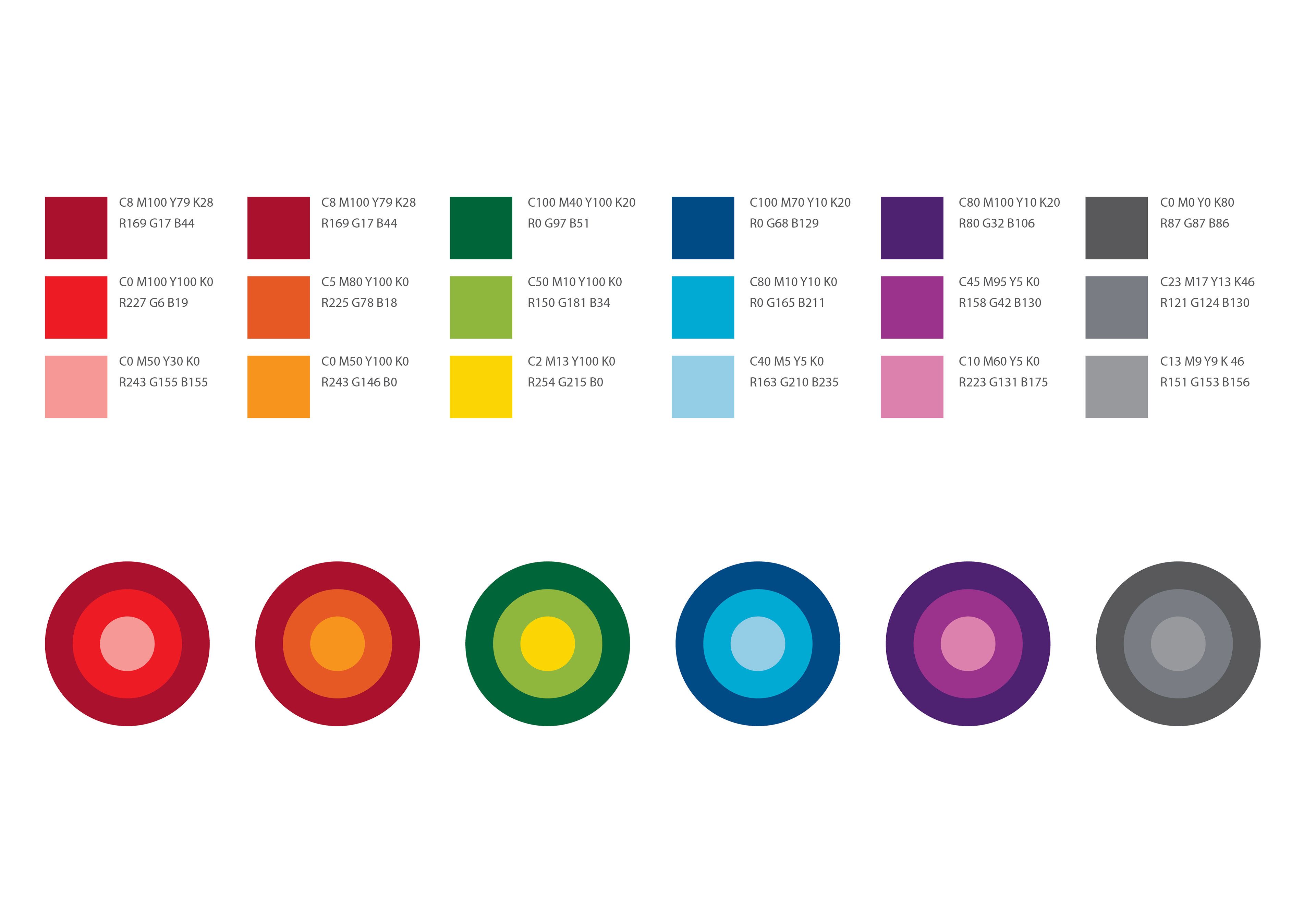
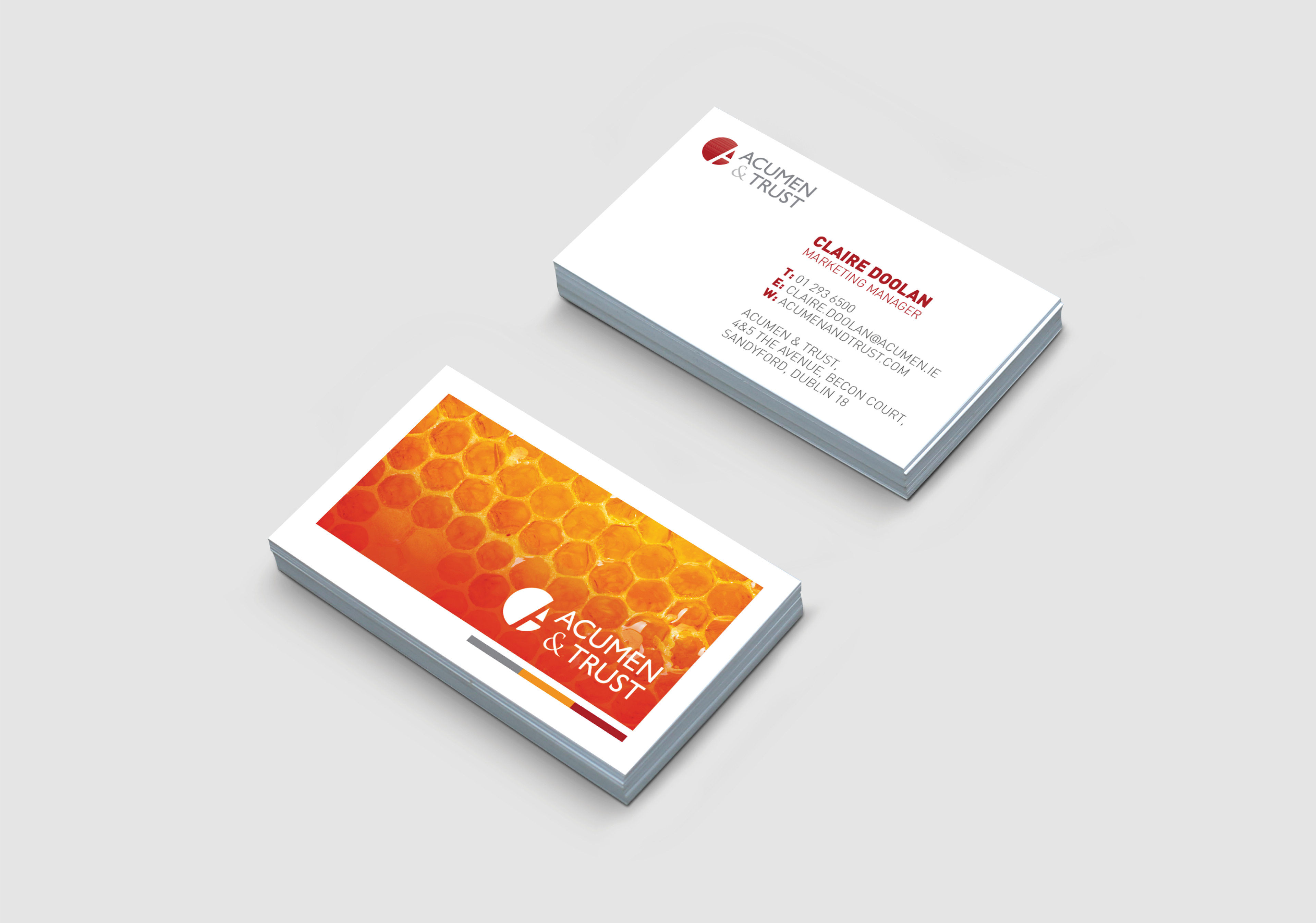
We developed a new set of colours for Acumen & trust that would enhance the red and grey colour palette that they were already using and wished to retain. It was important for them that they divided their business into 3 different areas – Employee Benefits, Financial Planning and Core Communications. These three sections have their own colour palette, helping to easily distinguish them.
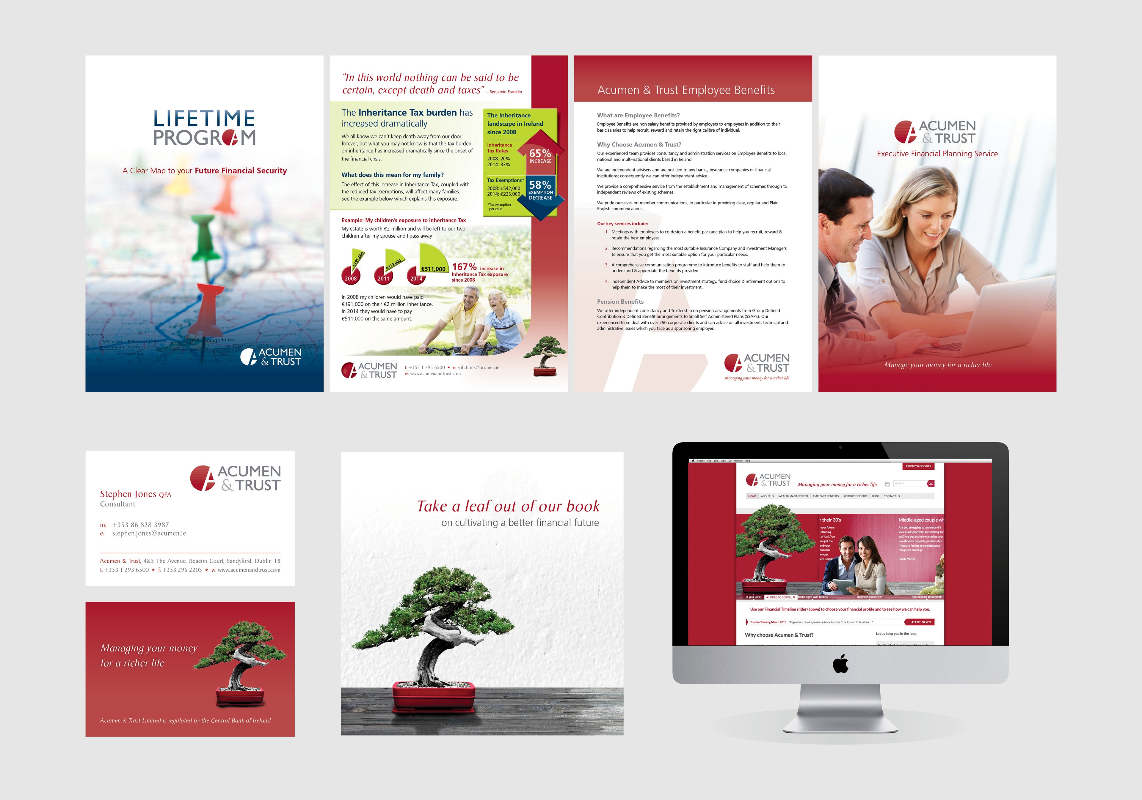
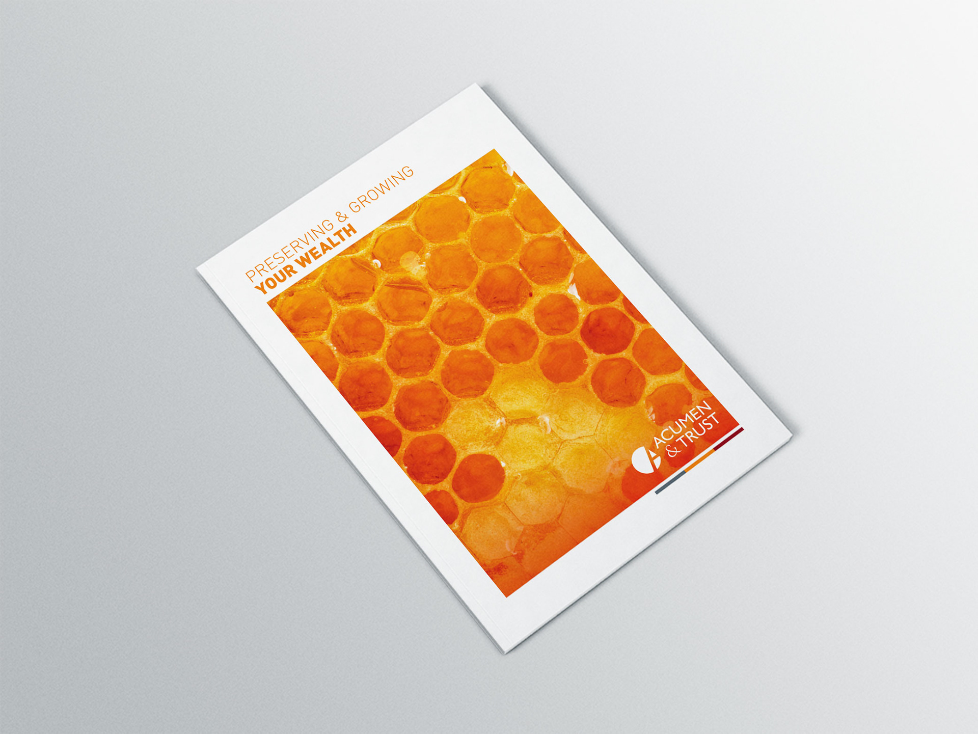
Below are examples of the above principles applied across core communications for Acumen & Trust. The honeycomb image is being used as the brands hero image.
We developed a number of icons to represent the different offerings of Acumen & Trust in Financial Planning and Employee Benefits.

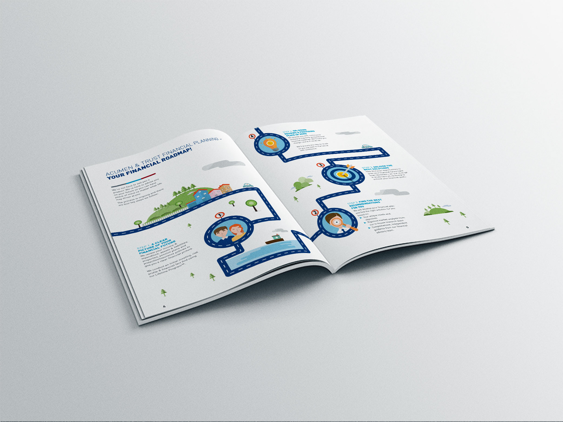
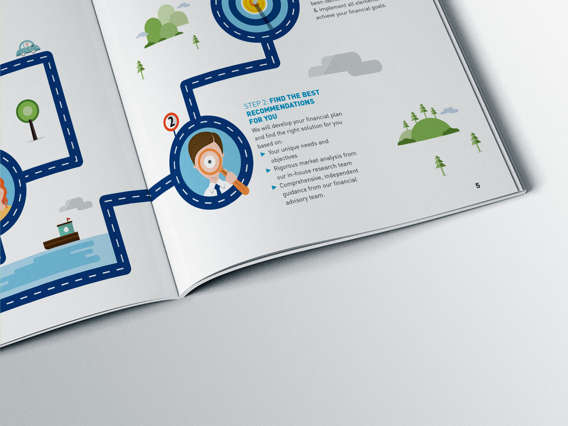
We also developed a number of user journeys both to be used client facing and internally.
We created a number of easy to use templates in Word and Powerpoint to ensure the brand would remain consistent inhouse.


