Project Background
Universal design is design that takes into consideration all types of users and their various needs when creating products.
For my project on universal design, I wanted to see ‘How might we create an app to help students with dyspraxia go about their daily college lives?.’ Developmental co-ordination disorder (DCD), also known as dyspraxia, is a condition affecting physical co-ordination. It affects 4.1% of college students and can make their daily college lives very difficult.
I also wanted to take remote learning into consideration, as we were going through the pandemic at the time. The college I focused on was IADT.
Research
Discover
The project started off by interviewing members of IADT faculty to find out more about the types of physical disabilities that were prevalent in IADT, the supports available to these students and the supports required. My main takeaways were that the supports from home were not great, resource access was poor, students felt overwhelmed, isolated, demotivated, they had problems structuring their day, completing assignments on time.
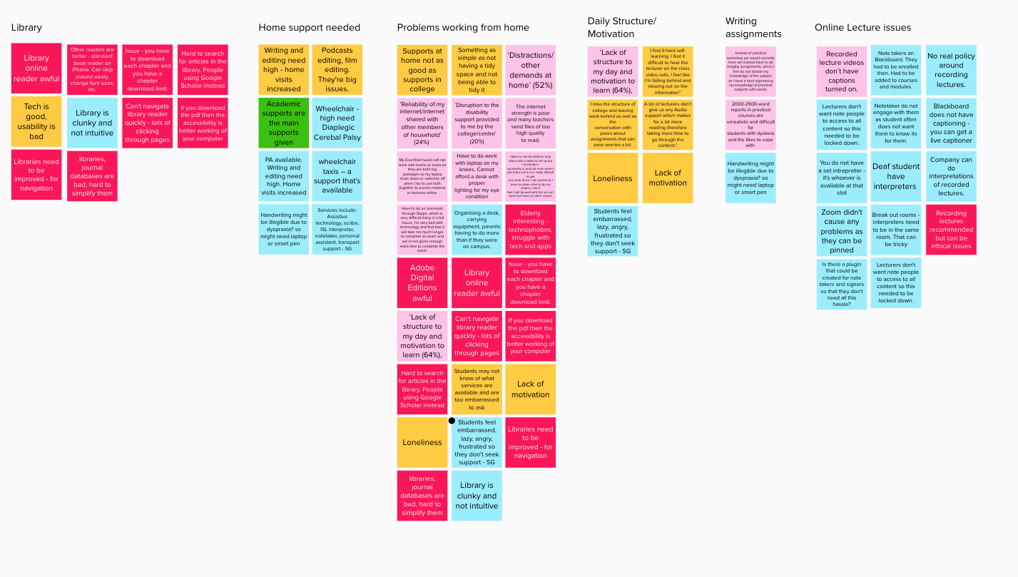
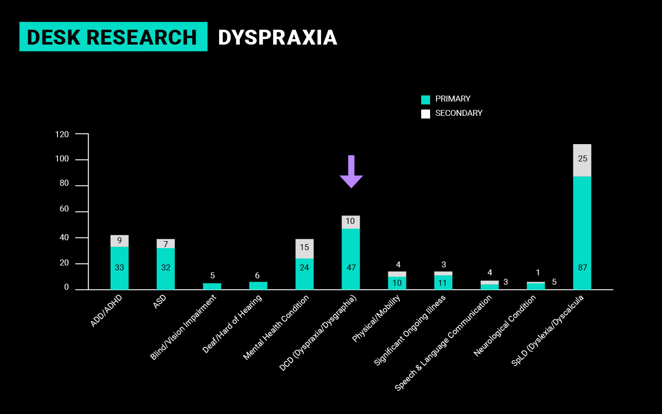
These results were quite broad, so to focus my research, I looked at the disability stats in IADT. I discovered that Dyspraxia was the second-highest physical disability in IADT, after dyslexia, and I decided to make this the focus of my project.
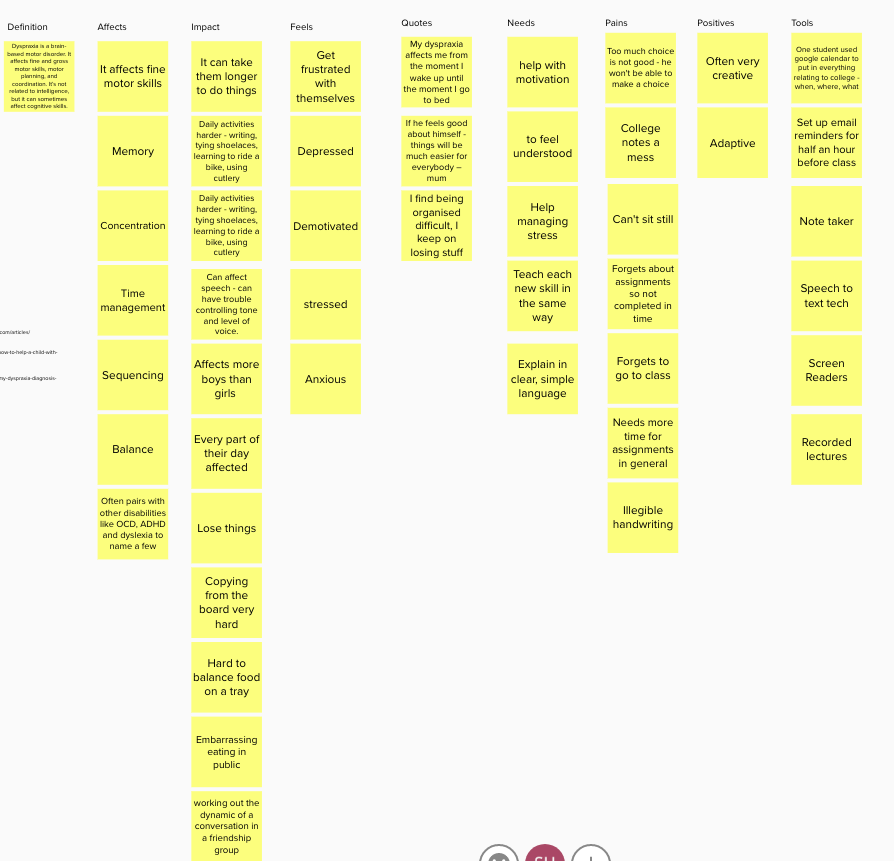
As I had no access to dyspraxia students, I watched many day-in-the-life videos on YouTube to hear the challenges these students face daily in their own words. I learned that many used multiple apps to help them remember to complete assignments, attend classes and remember things in general. Everything takes them longer due to the motor issues and their sequencing and memory problems.
Refine
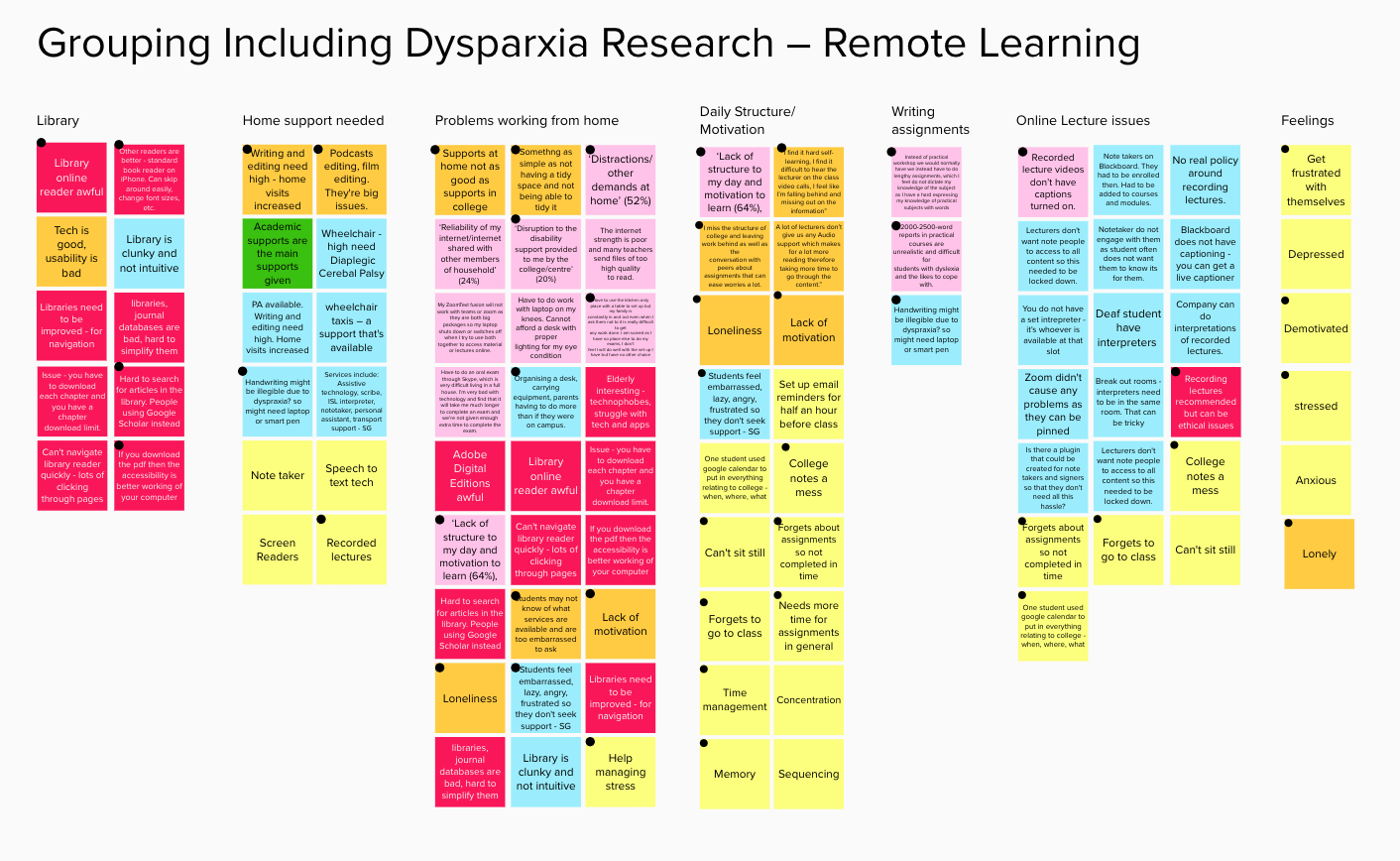
These results were incorporated into my initial research findings, which were then whittled down to key findings.
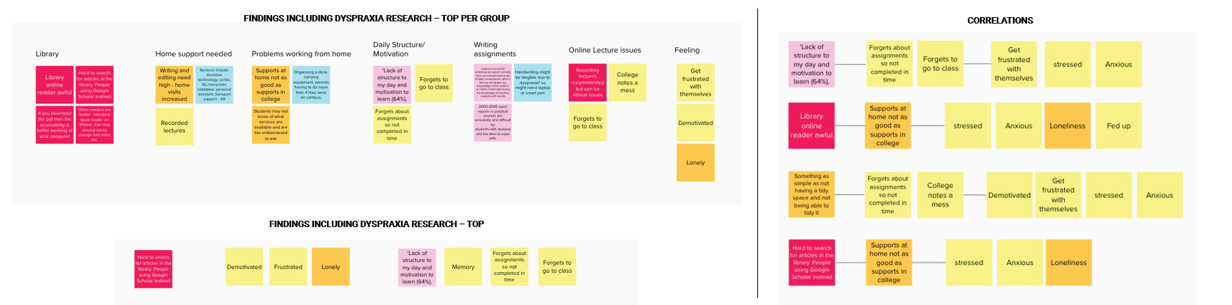
Top Findings
My top findings were that students were forgetting to go to class, forgetting assignments, embarrassed, frustrated, demotivated, found it hard to structure their day and they felt under-supported. I started to see how these areas related to each other and then developed my main persona.
Define
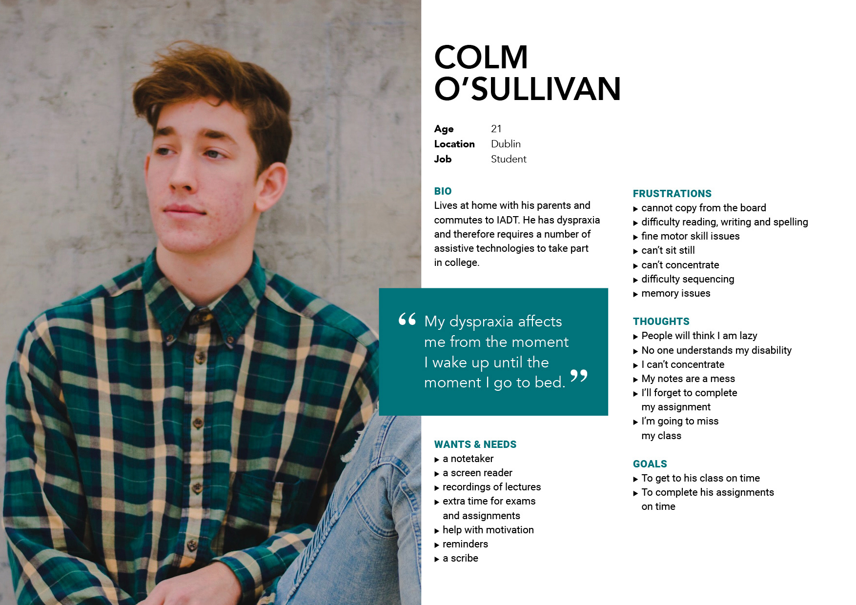
Persona
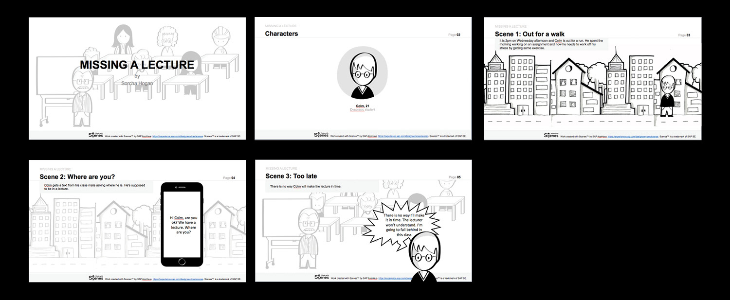
Meet Colm, a 21-year-old dyspraxia student from Dublin. His dyspraxia affects him from the moment he wakes up in the morning - where he doesn't know what is on his schedule for the day and is always afraid he has forgotten something - to last thing at night when he is not sure what is happening tomorrow.
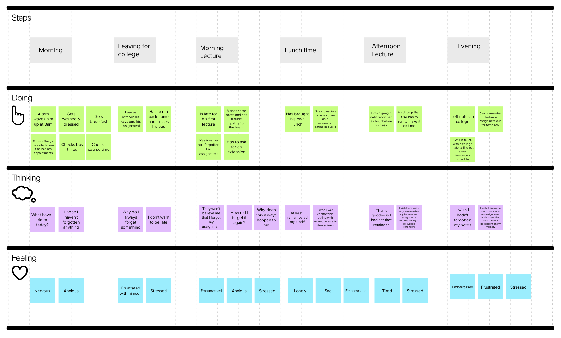
Customer Journey
I created a journey map to represent a day in the life for Colm. He leaves the house without his keys and his assignment. He is on the way to the bus when he has to go back to get them. He is then late for his first class. He has also forgotten about another assignment so has to ask for an extension. At lunch, he sits on his own as he is embarrassed to eat in public. On his way home he realises he has left his notes in college. His whole day is a difficult and it doesn't have to be.
POV Statement & Scenario
I worked on a number of POV statements to best frame the problems that Colm faced daily, finally landing on one.
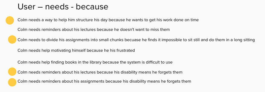
Colm needs a way to help him structure his day because he wants to get his work done on time and never miss a lecture
I then created a scenario based on one of the touch points from the customer journey to help inform where an app could start to come into play.
How Might We Statement
From this scenario, How Might We statements were created to focus the problem into something actionable. One final statement was chosen and this became the focus of the app.
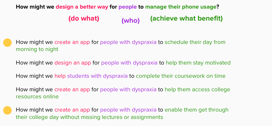
How might we create an app for people with dyspraxia like Colm to enable them get through their college day without missing lectures or assignments
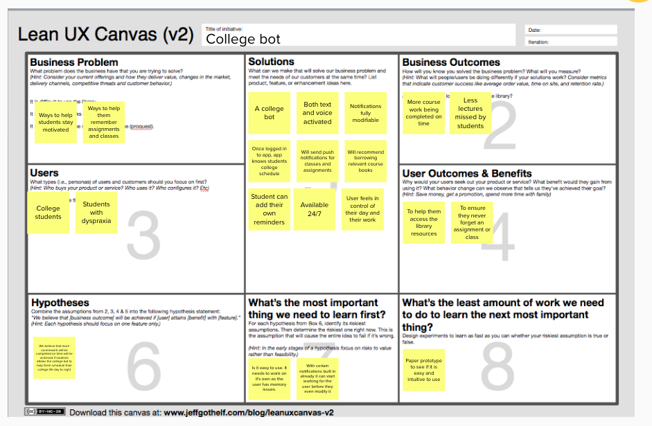
I then created a number of Lean UX canvases and landed on this one to pursue for my app. I decided to make an app that, once you logged in, was pre loaded with all your classes, assignments and book lists. Push notifications would be set up to remind the user about classes and assignments and these would be modifiable in the profile settings.
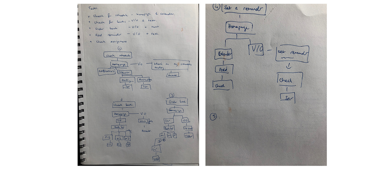
User Flows
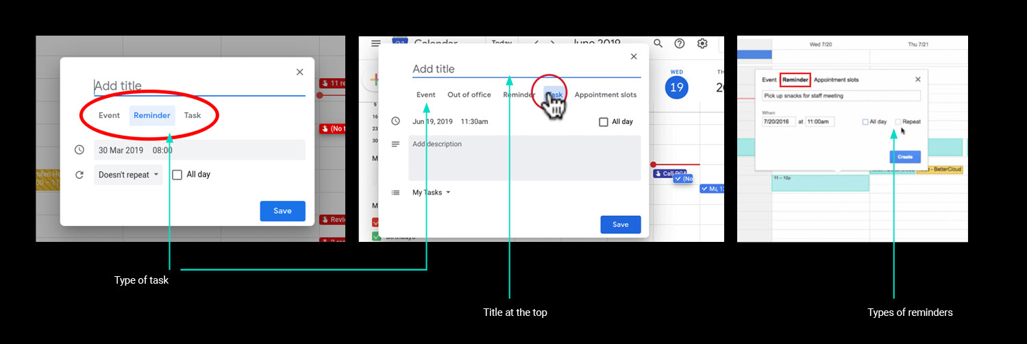
To figure out how the app would work, I started to research scheduling apps to see how they worked – mainly Google Calendar, Cortana, Bixby and 24Me. I then started sketching what kind of tasks would be useful in the app. Reminders would be very important so I spent a bit more time on this. It was important to include V/O as an option as many dyspraxic students are dyslexic so this would make adding notes and updates easier.
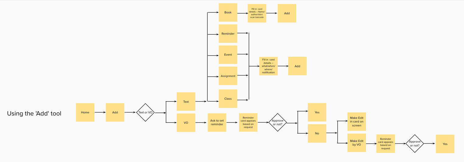
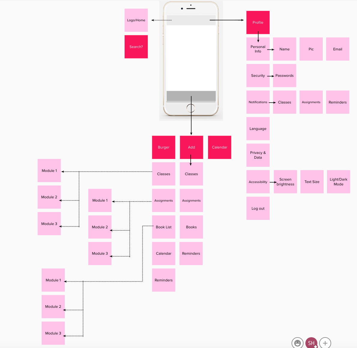
Card Sort
I did a card sort to figure out the sections and what should be in each one
Design Principles
Once I was ready to start designing I conducted desk research on the 7 design principles for accessibility to ensure these were incorporated. I also needed to make sure I was aware of the specific design requirements for dyspraxic students. What I learned was that;
• Designing the app in dark mode was better for dyspraxic students
• It was important to make sure that labelling as well colour coding were used throughout
• Ensure to use tpair text with icons
• Make sure the colour contrasts are in line with accessibility standards
• Use a larger font size
• Sans serif is best
• Keep the design and functionality as simple as possible
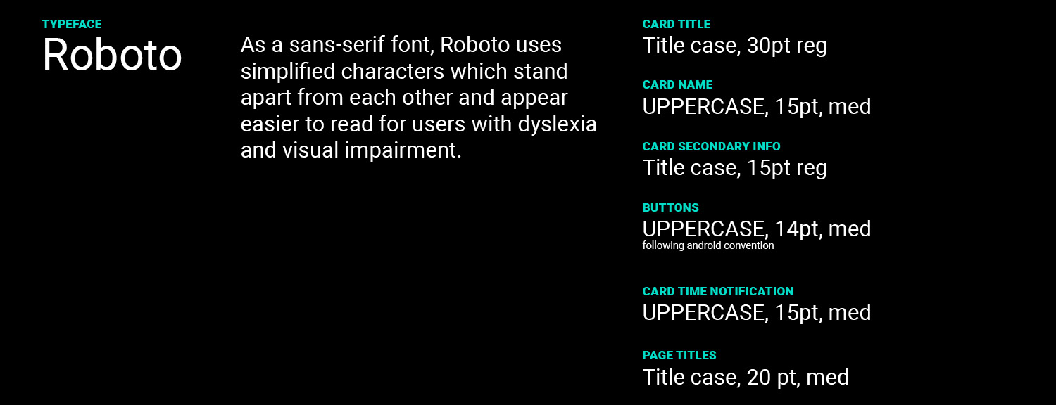
Roboto was chosen as the font and Material Design was chosen as the design system.
Prototype
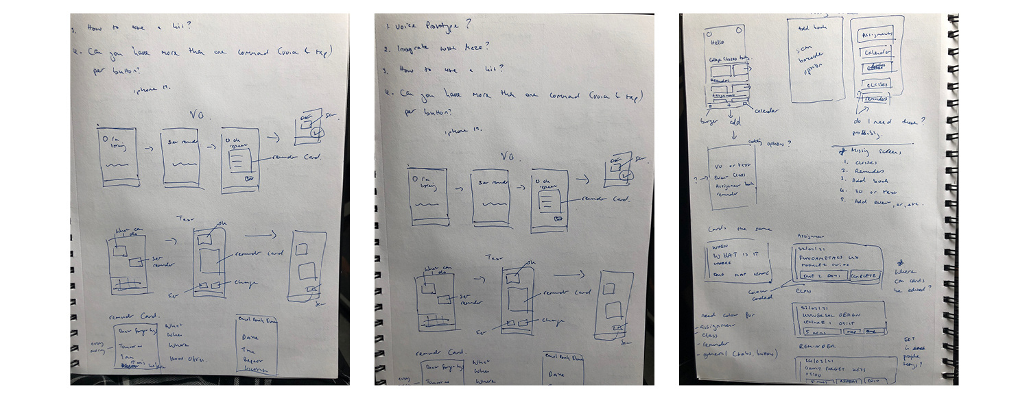
Sketches
I created some basic sketches of what needed to be on the screen and where and then I went straight into creating a wireframe in XD from my ideas. I needed to learn very quickly if the way I thought the app should work was right and helpful or not so I wanted to test my ideas as quickly as possible.
First XD Wireframe
Initial XD LoFi Designs
Initial XD LoFi Designs
Initial XD LoFi Designs
Findings
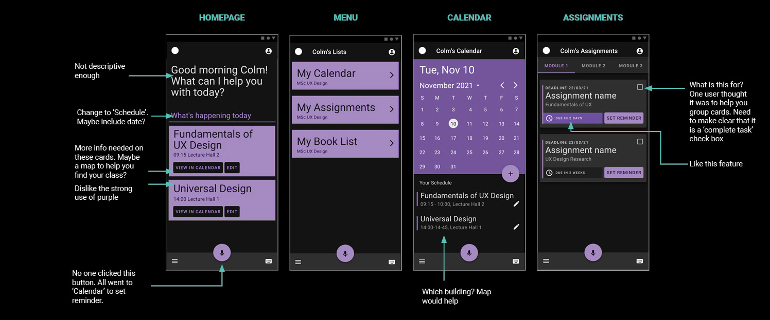
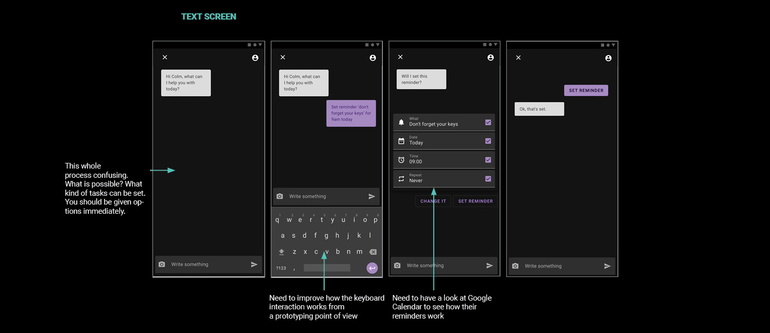
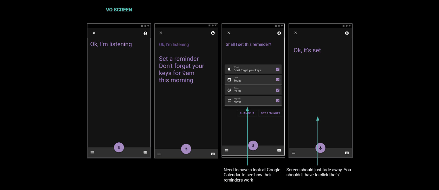
It's fair to say I learned a lot as I got a lot wrong on my first attempt! The reminder journey needed to be massively adjusted, the nav buttons needed to be changed, map functionality needed to be added, how the VO and keyboard functions worked needed to change drastically! And the purple overwhelmed the users. On advice from my users, I went back to Google calendar and had a good look at how it worked.
More Interaction Research
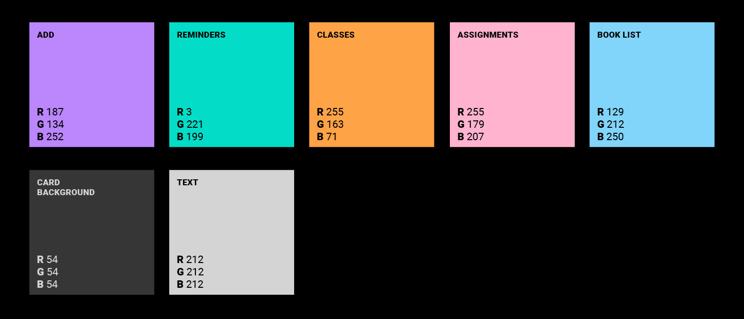
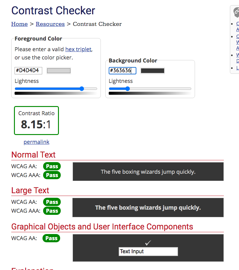
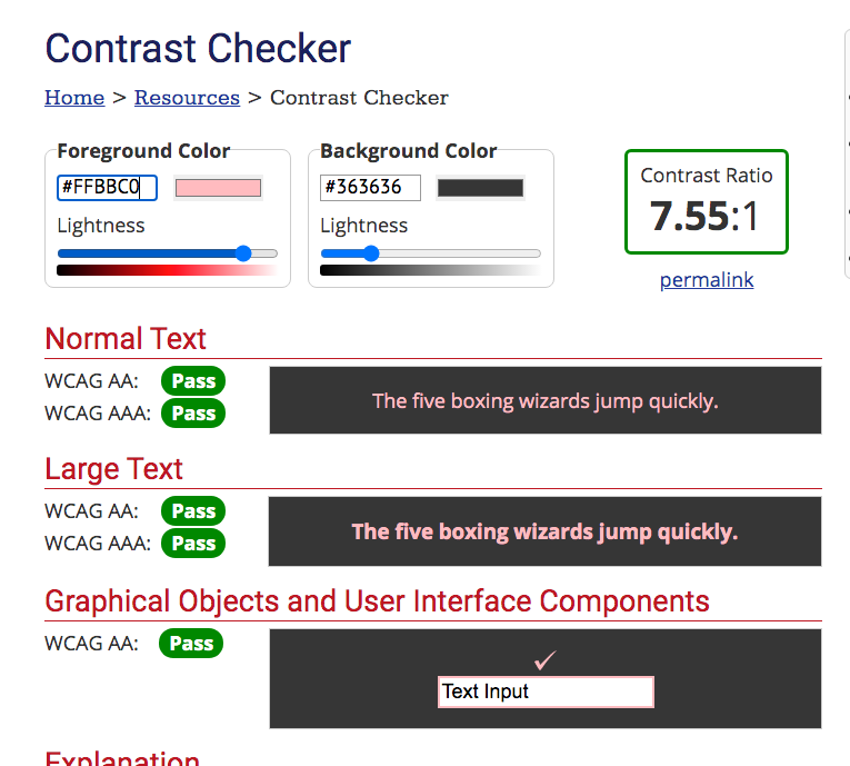
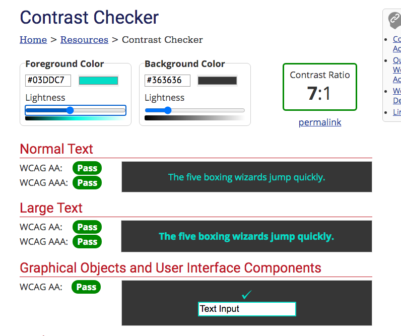
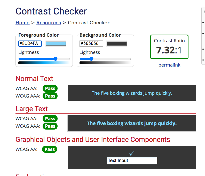
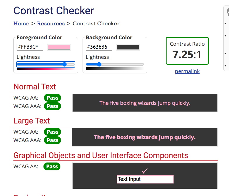
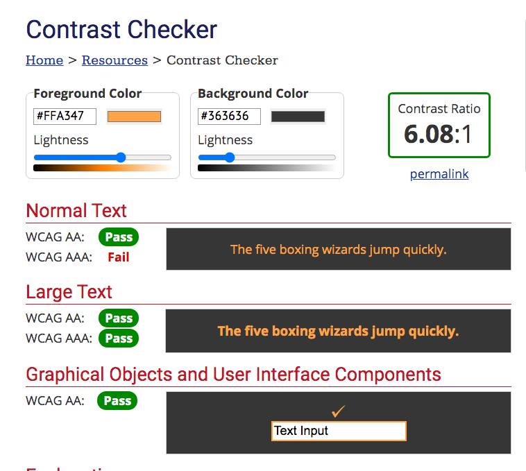
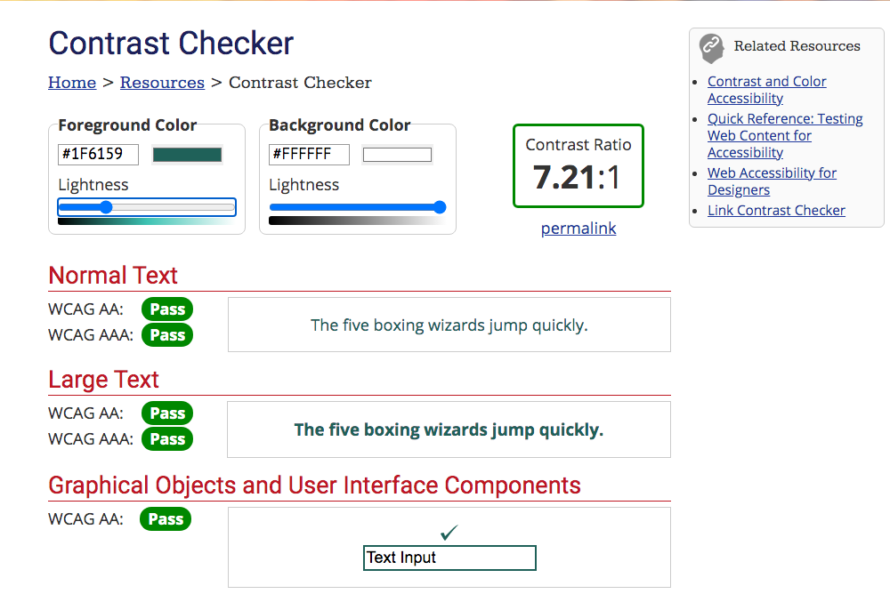
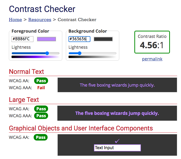
Colour and Contrast Tests
I also spent some time choosing colours and doing contrast tests to ensure the app met accessibility guidelines.
First Full Prototype Design & Testing Results
I took all of my findings and put them into my first full prototype which I then tested with 5 users. Below are my findings and subsequent design iterations.
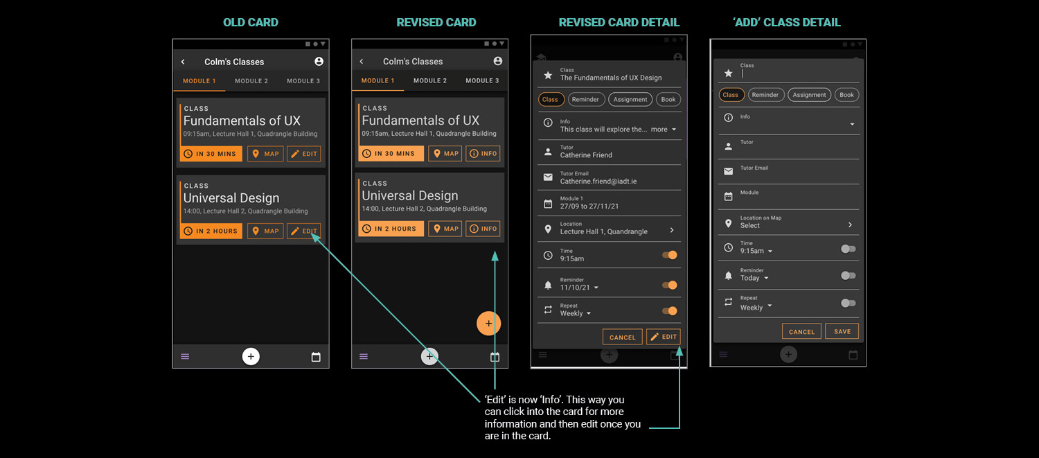
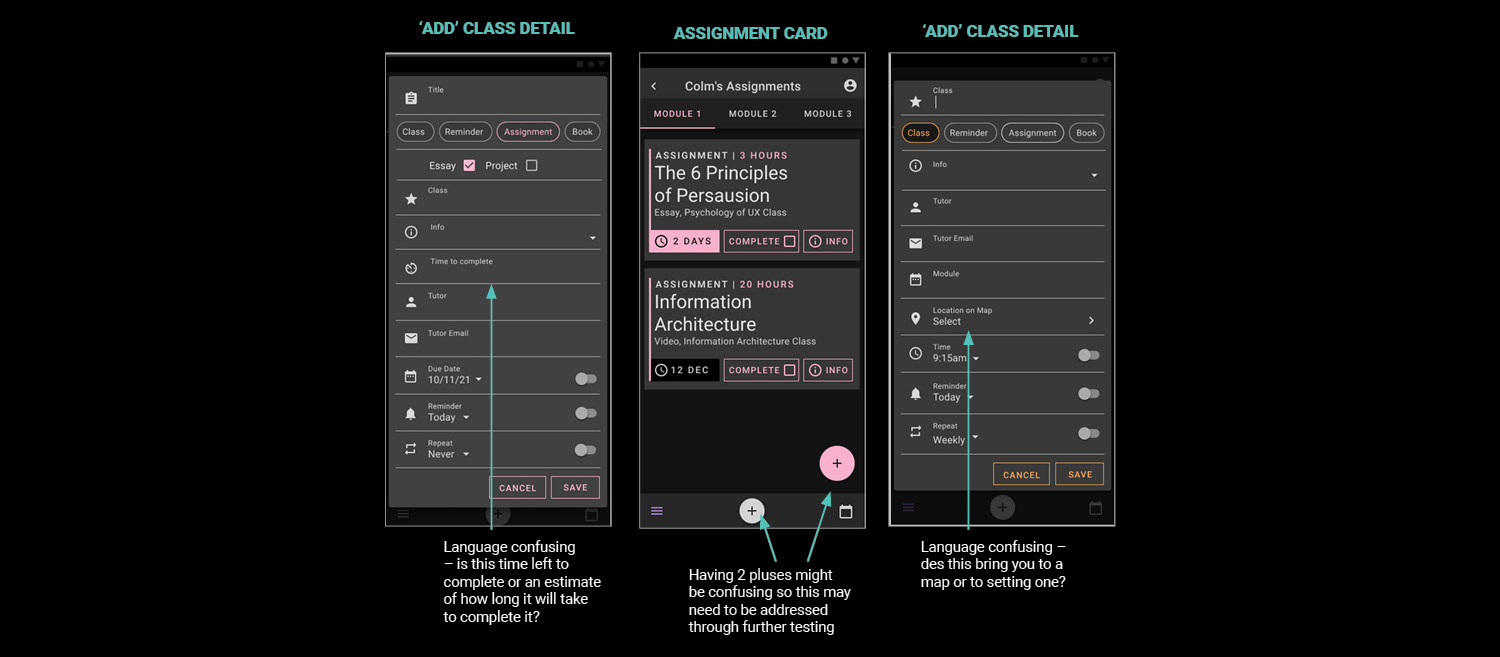
First full prototype test – amends to Classes Cards based on testing
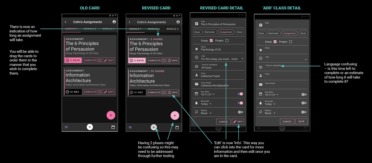
First full prototype test – amends to Assignment Cards based on testing
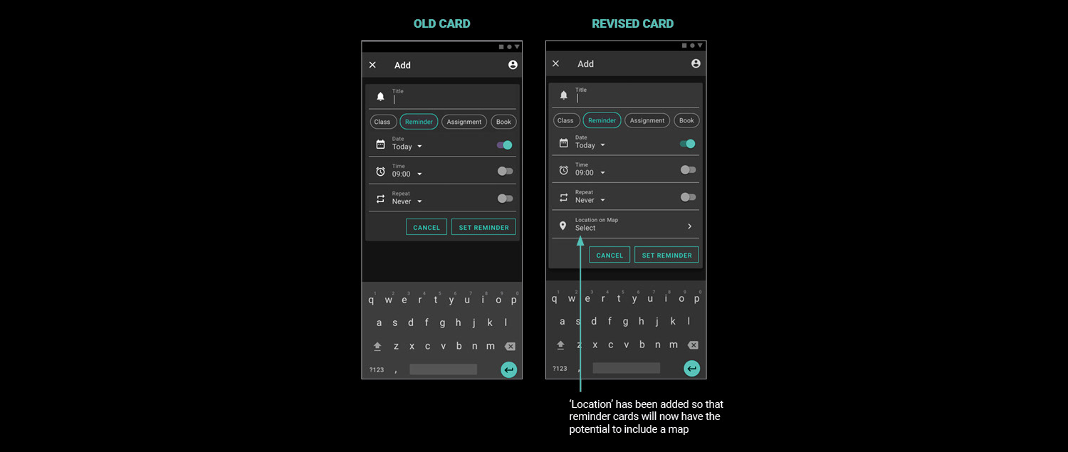
First full protoype test – amends to Reminder Cards based on testing
Second Protoype Walk Through
These tests went really well but there were still areas for improvement. I incorporated my findings and what you are about to see now is my second prototype.
Strengths
From my testing I learned that my app has many strengths:
• It is clear and easy to use
• All users found the design attractive
• All users loved the map functionality. One stating it is a feature he hadn't seen before it would have helped him a lot this year navigating college.
• The class and assignment cards were really helpful
• It is clear and easy to use
• All users found the design attractive
• All users loved the map functionality. One stating it is a feature he hadn't seen before it would have helped him a lot this year navigating college.
• The class and assignment cards were really helpful
Weaknesses
• All users took a minute to realise the logo top left was a button. Two users found the burger position confusing – they felt convention was for it to be positioned top right.
• ’Location’ in the class card is confusing – one user thought this would bring them to a map. The functionality needs to be looked at. ’Time to complete’ – the language confusing in the assignment card – one user thought this was time remaining on the assignment as opposed to an approximation on how long it would take.
• Finally, the two ‘plus’ buttons at the bottom of the page may be confusing
While the class and assignment cards have been tweaked, they could still be more robust. The language around how long an assignment needs to take could be improved. Messaging a tutor could be incorporated and maybe it would be nice to be able to submit assignments through the app.Another potential issue is the double plus. The plus at the bottom had originally been a mic and it's function is to allow the user to add any card at any time.
First full app test – amends to Assignment Cards based on testing
Future Considerations
• Fix listed weaknesses
• Design up the Light Mode version of the app and put it for testing Possibly have automated cards (like classes and assignments) different to reminder cards
• Consider including a way to message tutors in the app
• Consider adding college support contact
• Spend time on the settings in the profile page
I would also like to spend more time on the functionality behind ‘adding’. Currently, you should be given both keyboard and speaking options whenever you want to add anything. This may become repetitive if you have to choose every time you want to add anything. Should you just be able to speak at the app – like Siri or Alexis – for voice functionality and then in the nav, only have the option of the keyboard? Secondly, some of the cards are quite robust so, for the speaking option, should the user be given prompts for each section that needs to be filled in the card and what does that look like?
Conclusion
It is impossible to design an app that will suit absolutely everyone. For example, this app has been created with dyspraxia in mind. Dark mode suits them well (M.A.W. Consulting, LLC.; Recite Me, 2020). However, users with certain visual impairments prefer Light Mode as an effect called halation can occur when they use dark mode which makes it difficult for them to read the screen (UX Movement).
What we can do is design apps that have options built into their functionality that give users the freedom to modify their apps to their liking. We should, and can, design to include all users.