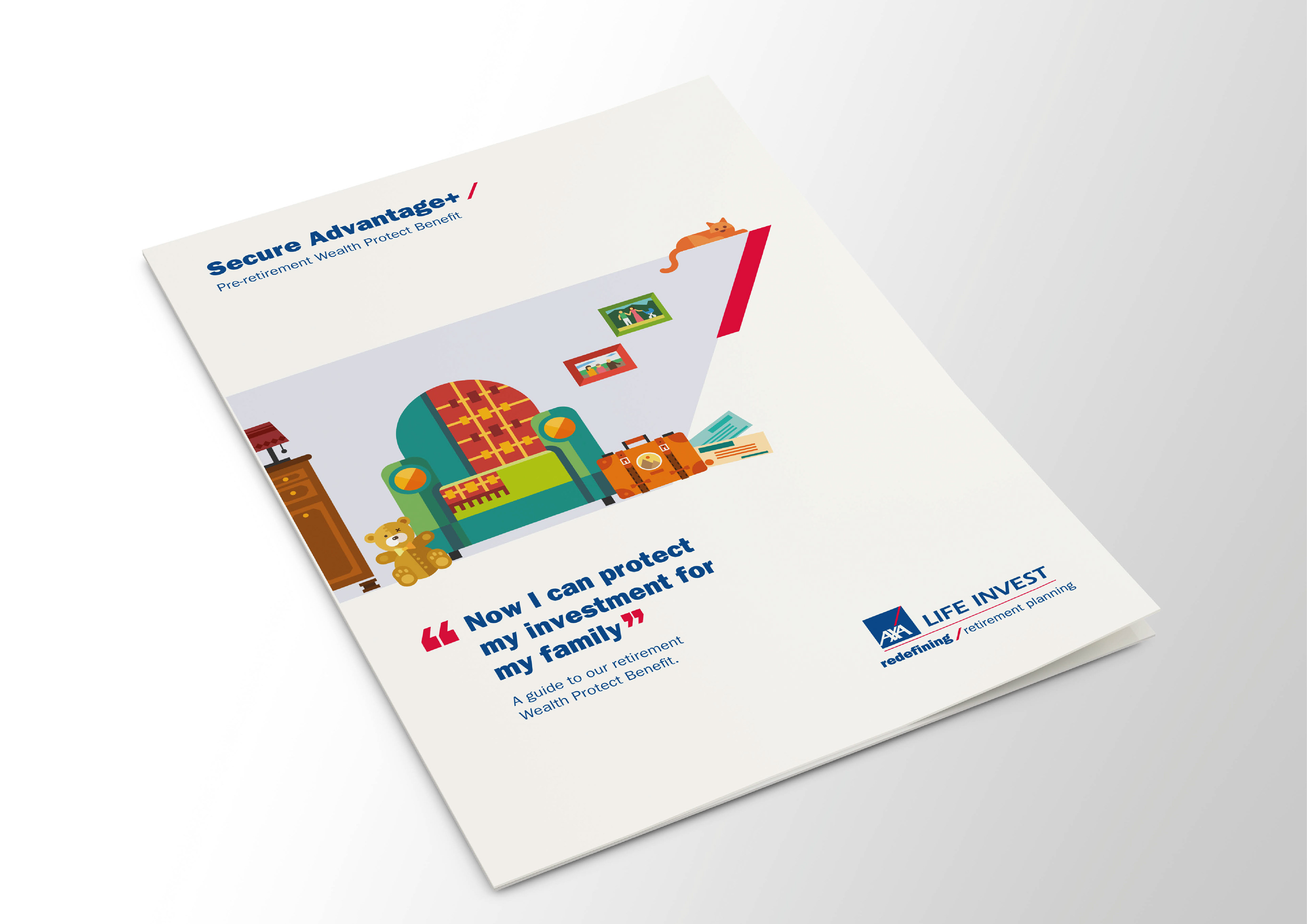
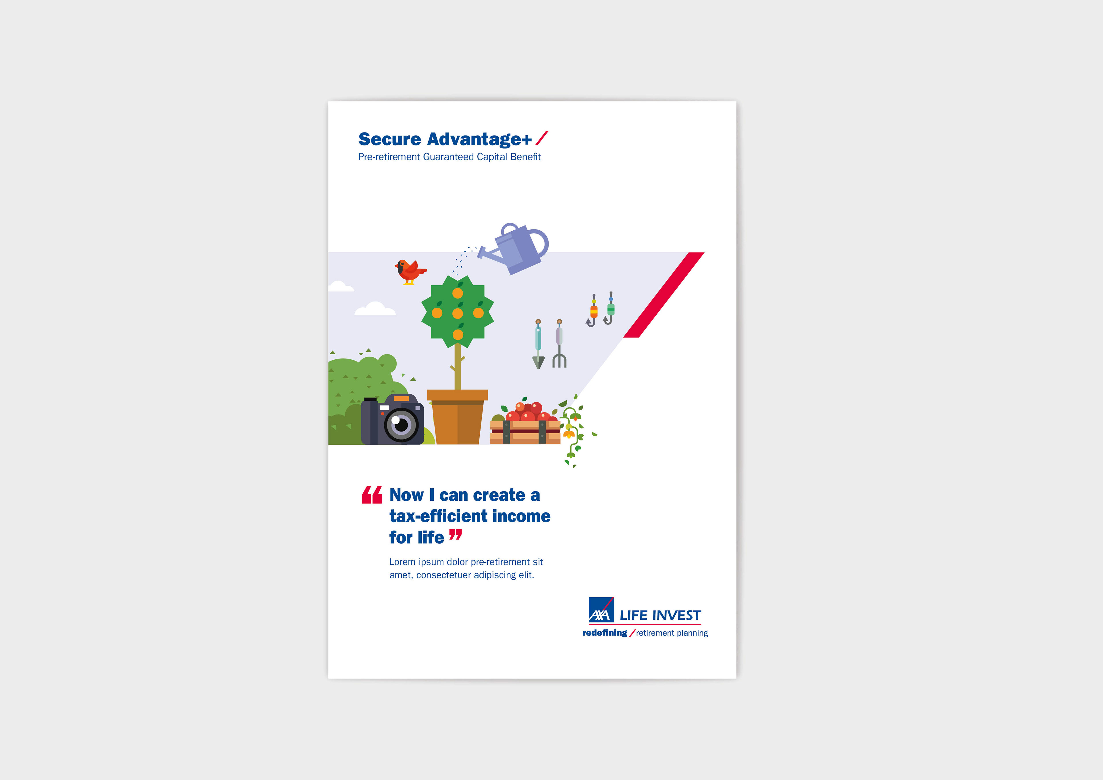
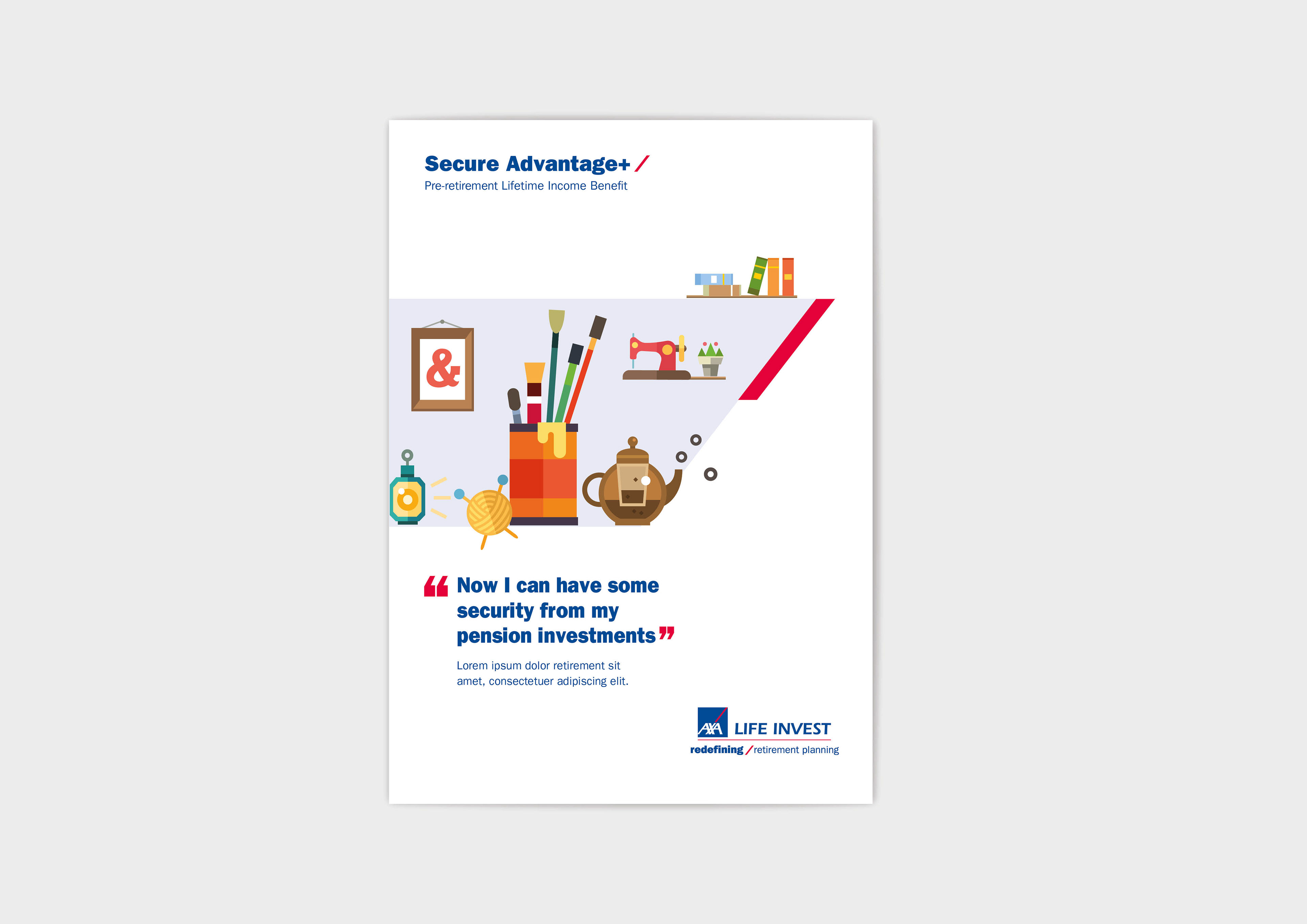
The following designs presents the best moments of retired life for the 4 different personas, gathered together to give a snapshot of the aspiration and goals achieved through the purchase of the AXA investment plan.
The visual elements are carefully chosen to loosely tell a story in a bright, vibrant and accessible style, held together by a ‘viewfinder’ device which is colour coded to demarcate the differing brochures.


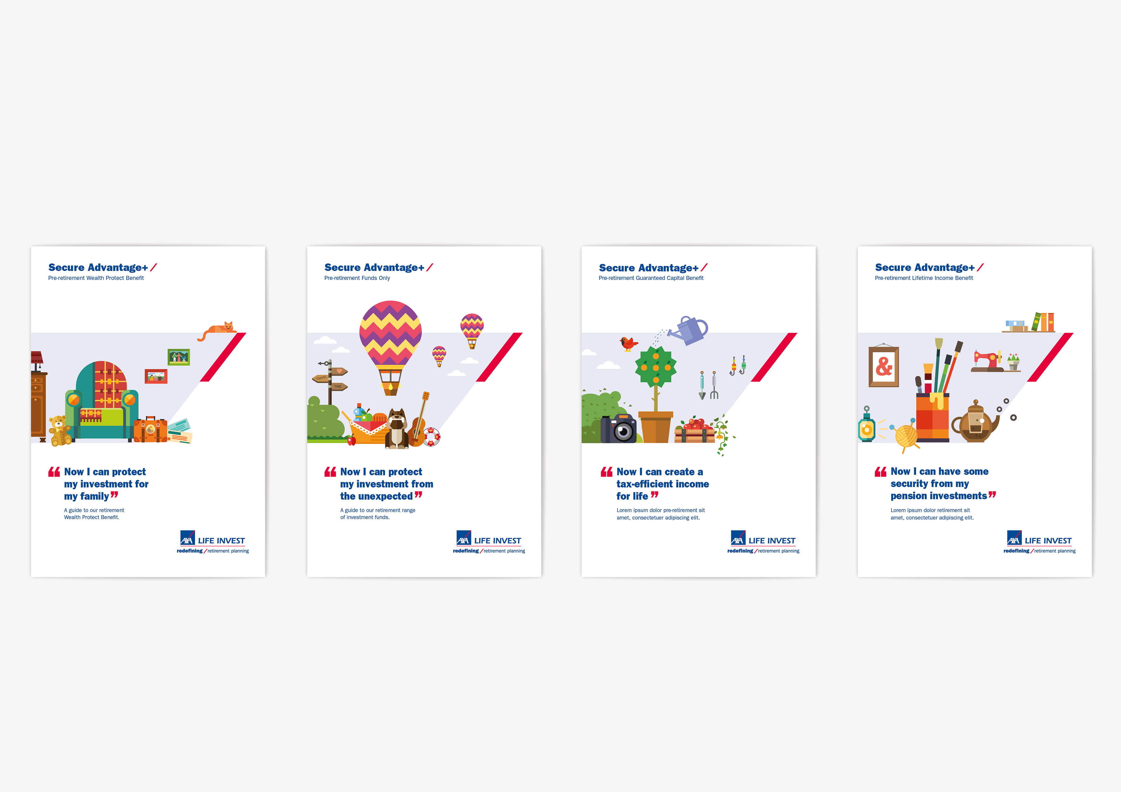
There are two options in highlighting the sub-set brochures within each product: pre-retirement / retirement. We can simply include the differing terms within the descriptive text applied to each brochure. This can slow down the process of document selection however, when the sales force and IFAs must read through each brochure.
Within a short space of time the variance of colour can become a key identifier for product and sub-set.
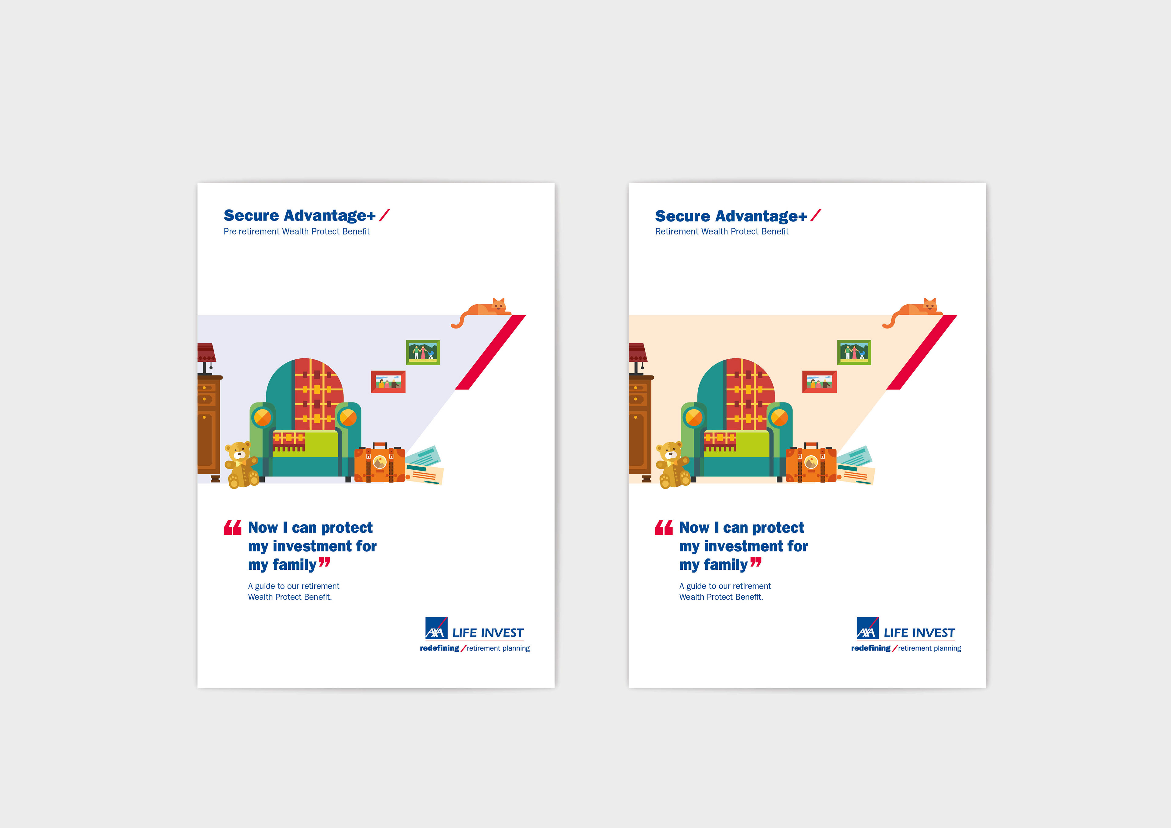
A third colour was required to represent the product as a whole. Green was the natural choice as the 2 products the pack contains are coloured blue and yellow.
The flexible nature of the design is very noticeable here as elements from all 4 personas can be brought together easily and quickly to advertise the product as a whole.

Below is the homepage we created, based on the existing structure of AXA Life Invests website. It demonstrates how the new graphic language can easily be applied to their existing framework.

