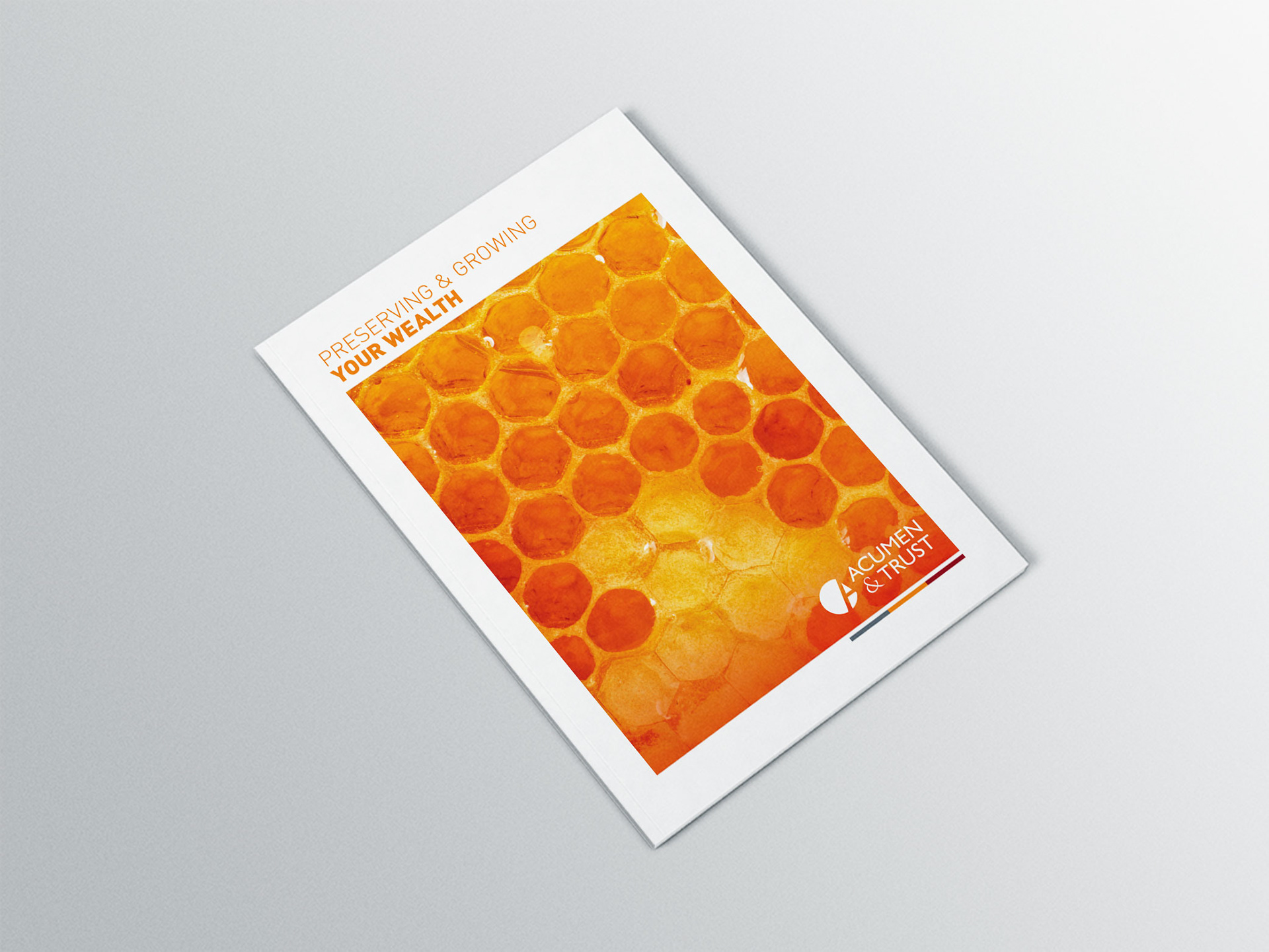
Brochure cover using new hero image
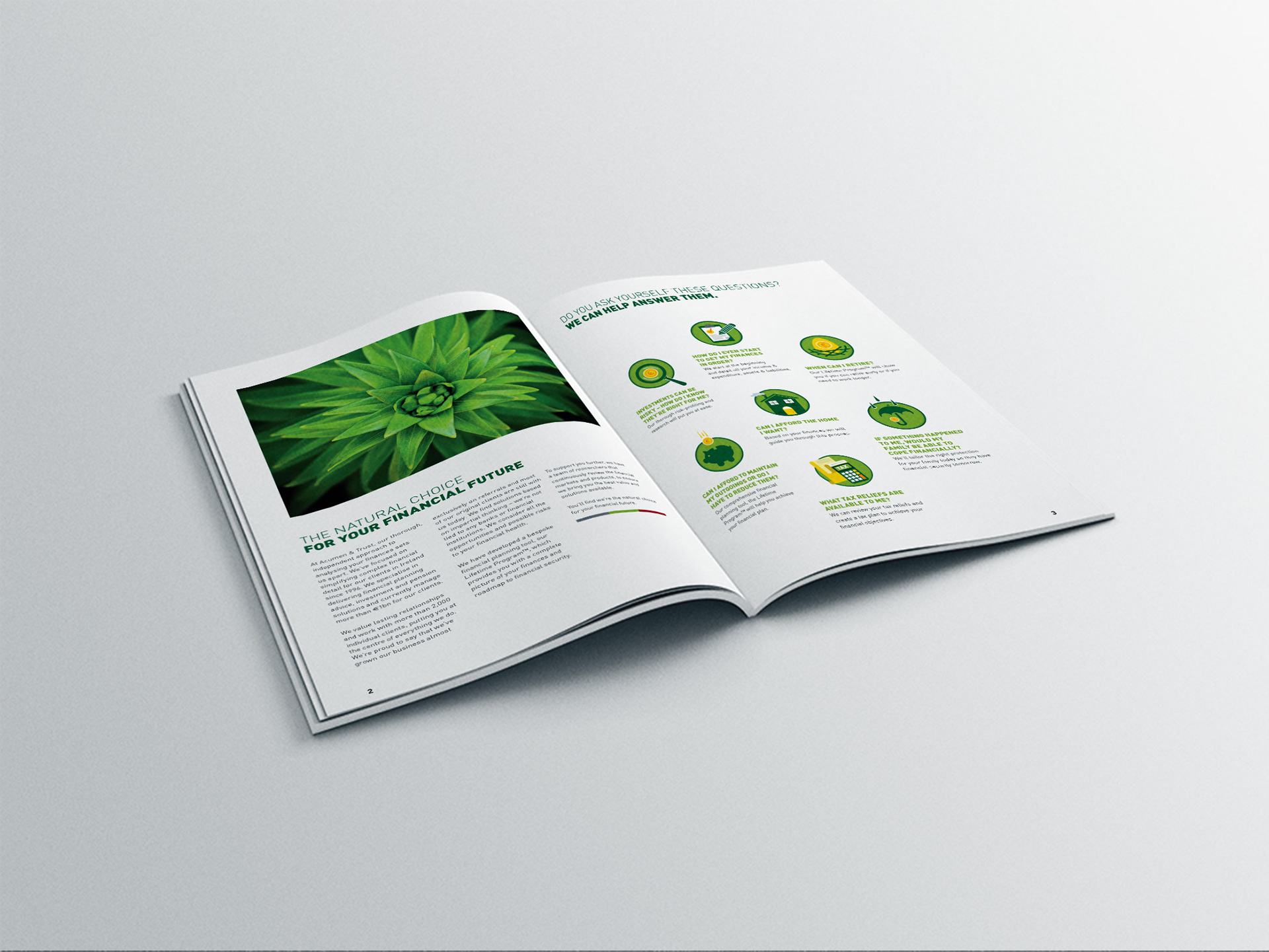
Interior page, using newly designed icons
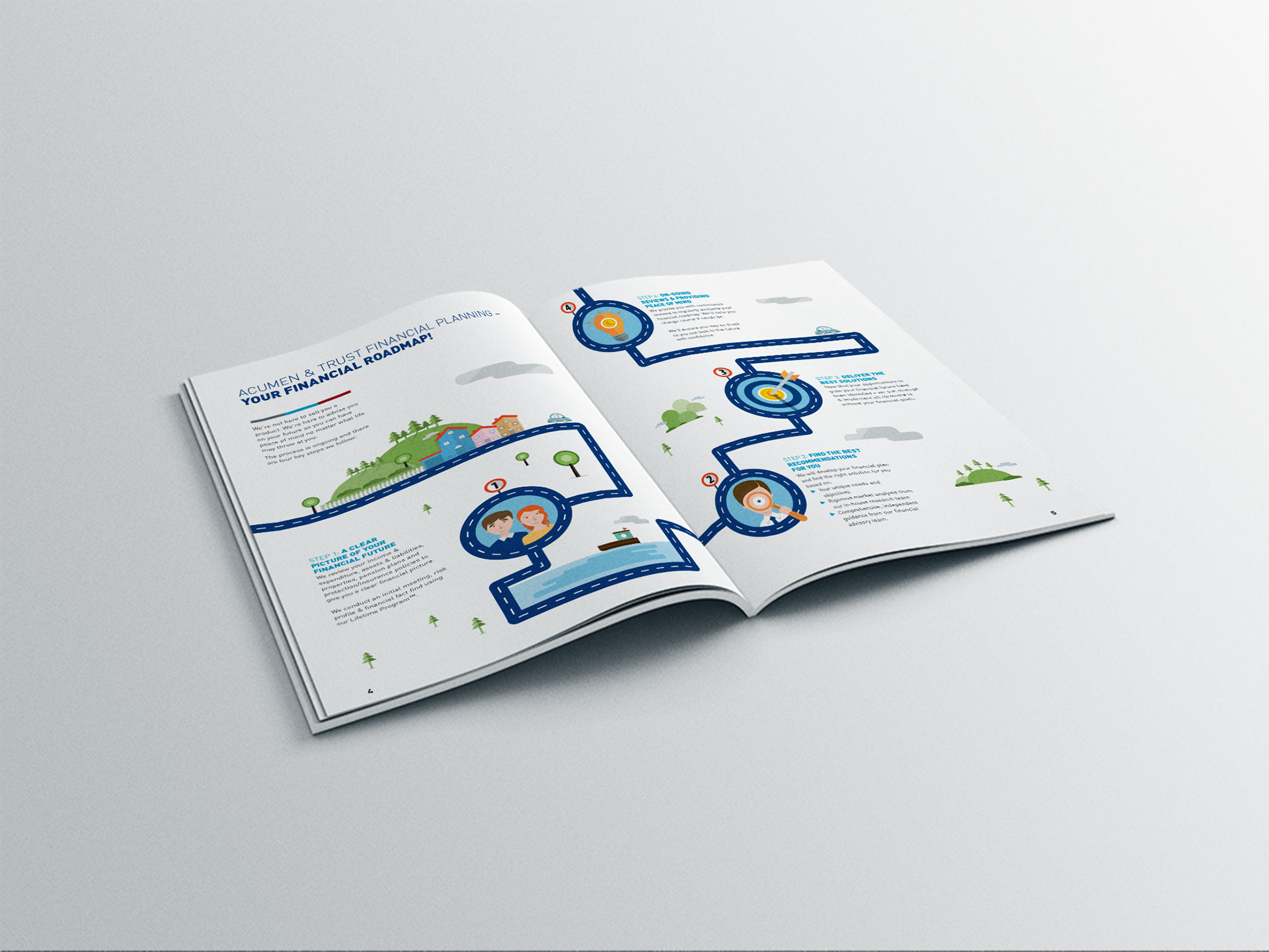
Financial Roadmap Design

Financial Roadmap – close up
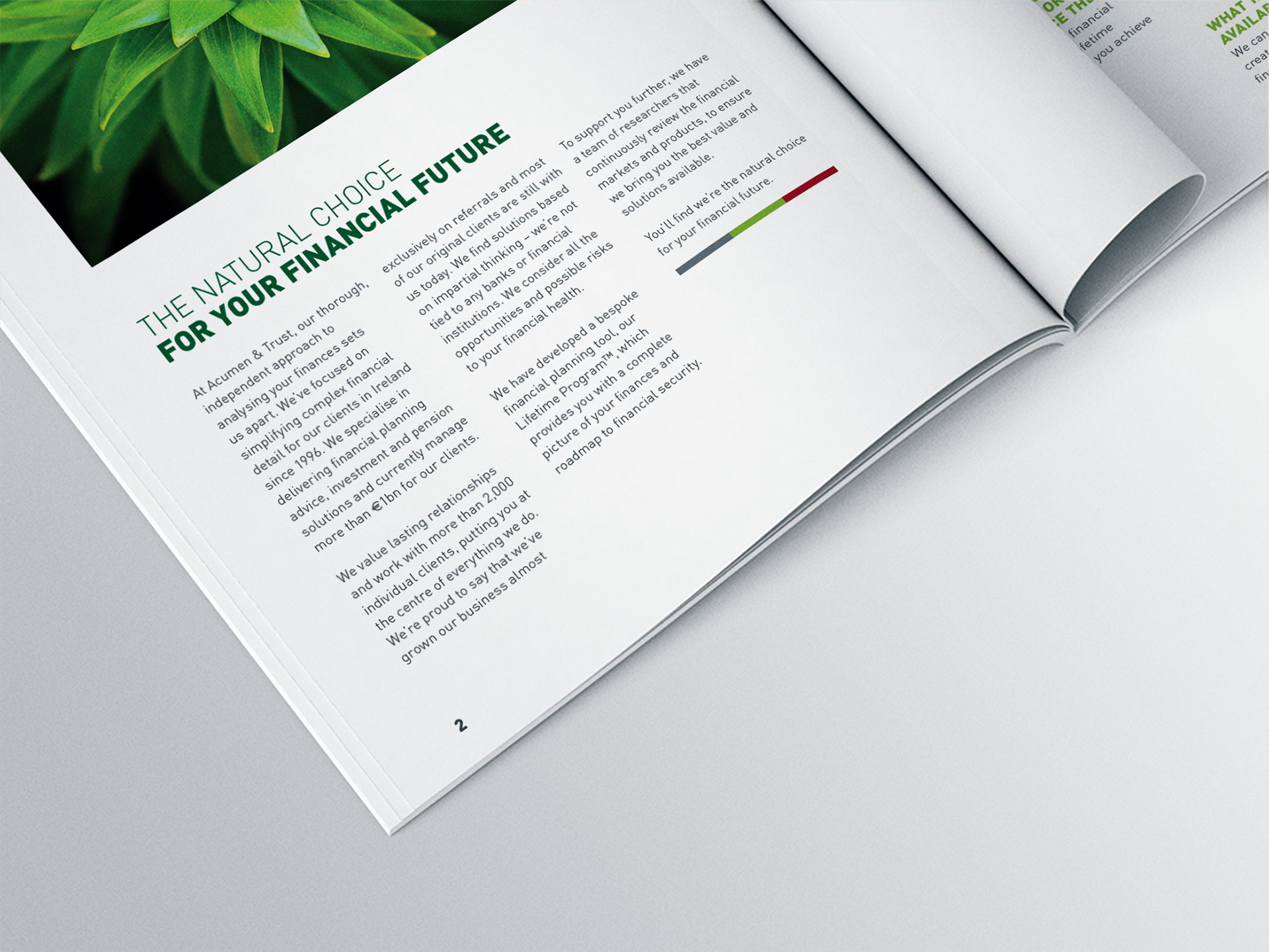
Page close up

New business cards

Internal Word Document Templates

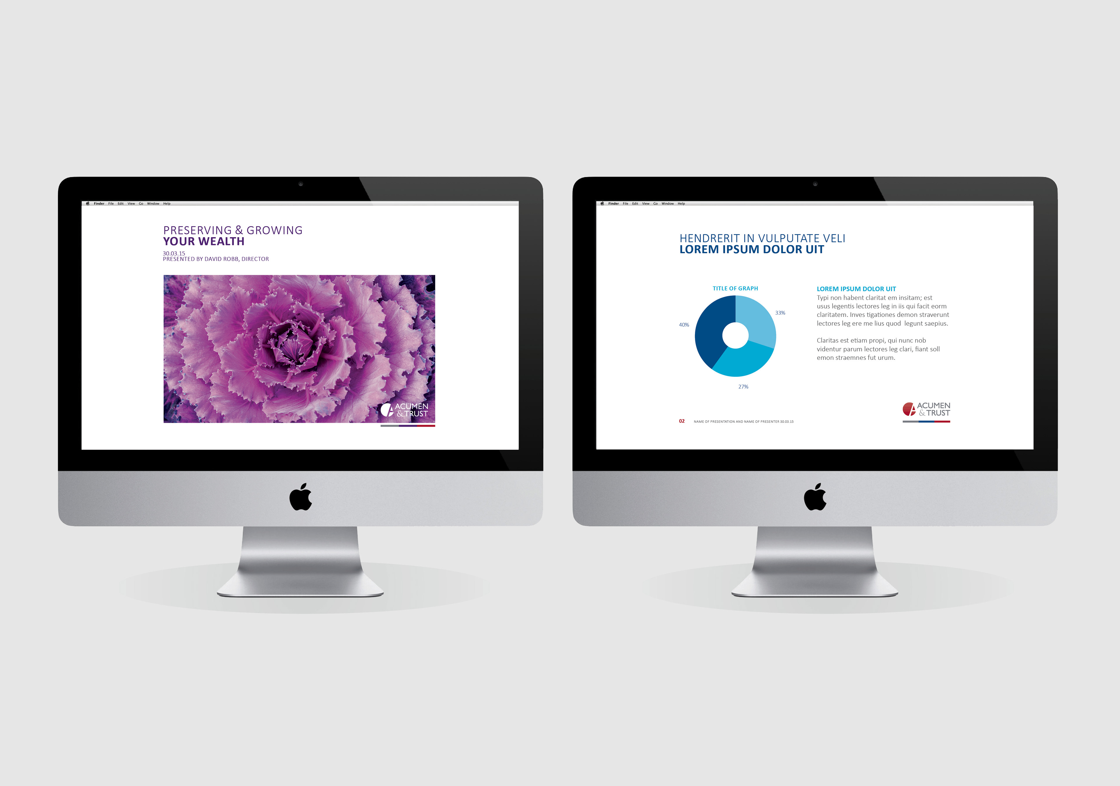
Internal Powerpoint Templates
Acumen & Trust has been providing independent financial advice to its Dublin customers for 20 years and true to the name it has built a strongly trusted relationship with each and every one.
The company wanted to refresh its image and communications without losing sight of its core values and identity in a way that emphasised its difference in the marketplace. We began by researching, understanding and mapping how it engaged with clients; uncovering the needs and desires of the different client types and how Acumen & Trust could engage with them in a meaningful and effective way.
By developing a visual style and tone of voice that was unique in an undifferentiated sector, we retained the warmth and personality of the company. We uncovered the core idea of perpetual development and constant growth. A suite of vibrant and natural imagery was developed to articulate this, followed by a range of illustrations that clearly identified the benefits of their financial planning and investment guidance while affirming the personal treatment each client receives. A refreshed identity and brand system elevates the level of professionalism but in a bright and positive way.

Hero Images
It was important that Acumen & Trust Imagery stood out against their competitors. After a lot of research, the idea of fractals was employed as the foundation for all images.
A fractal is made up of many simple structures that are all the same but build on each other to create a larger structure. This lent itself perfectly to the idea of saving – putting the same amount of money away regularly builds to form a strong foundation for your retirement. Below are the key images that are being used by Acumen & Trust.
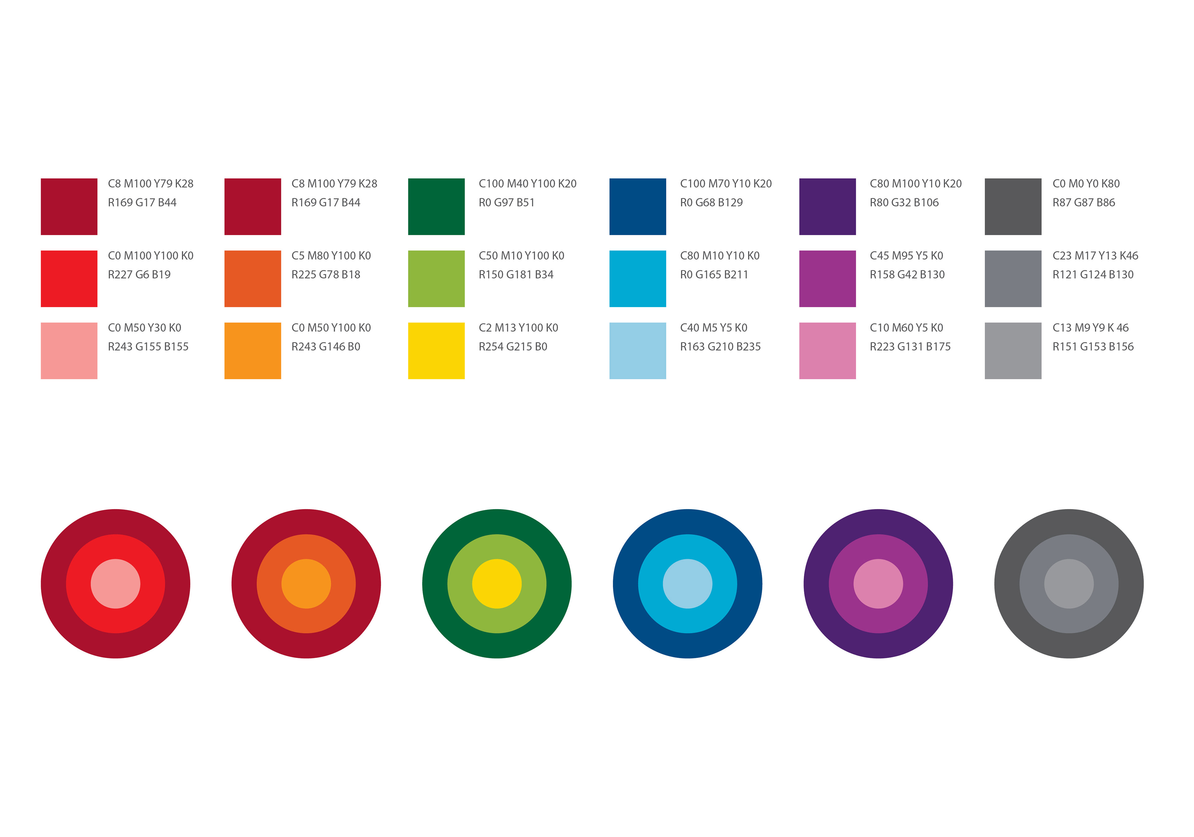
Colour Palette
We developed a new set of colours for Acumen & trust that would enhance the red and grey colour palette that they were already using and wished to retain. It was important for them that they divided their business into 3 different areas – Employee Benefits, Financial Planning and Core Communications. These three sections have their own colour palette, helping to easily distinguish them.